branding can be utter bollocks, and just to prove it here is an example.
the european union is about to celebrate 50 years, in order to do it in style they held a competition to design a funky logo.
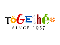
1700 students entered and the result is breathtaking.
breathtakingly bad.
the winner is szmon skrzypczak.
the design is supposed to encapsulate the idea of european co-operation and the future of europe. now i am no designer, but i can see that is going to be a hard one to capture in a static logo.
in fact what we get is some dodgy typefaces and accents that are used in european languages that come together in a colourful mess that spell “together” (ignoring the fact that all the letters do not hang together very well, and in fact look like a mess. though someone could argue, but they would be clutching at straws, this demonstrates the differences within the union and the fact it can work in harmony. but we all know that would be bollocks).
also it has to be noted that the logo will look different in each country as it will be translated and each one will have the “correct orthography” so in fact they will all be different and not together…. my head hurts.
the “since 1957” tagline refers to the signing of the treaty of rome. it also plays two other functions 1] one it gives a tacky air of being a retail chain logo and 2] it will remind people that it is a 50 year anniversary logo.
mr alejo vidal-quadras, first vice-president of the european parliament, said of the logo " i congratulate the winner for the very nice result, which expresses very well our common destiny".
while vice-president margot wallström said: “the winning logo represents the diversity and vigour of europe and at the same time it underlines the desired unity and solidarity of our continent.”
both demonstrating the ability of politicians to talk meaningless bollocks while making it sound important. (press release
to be found on the competition website)
the bbc ) also has some quotes which it says is from the competition website but i can’t find them there, but here there are from the bbc:
"this logo gives a graphic interpretation to the voice of all europeans, especially the new generations.” i am sure they don’t mean it, or even know what they are saying but then they had to say something.
"the word 'together' expresses in a simple and immediate way what was originally bound to the idea of europe: not only politics, or money, or geographic boundaries, but most of all co-operation and solidarity." and just in case we hadn’t picked up on what “together” might mean in this context they spell it out for us…
it also praises the irony "inspired by fashion labels". i have no idea what they are going on about here. but i suppose it is better than the ukip proposed design “fcuk europe”.
my pal jay
was most impressed that the winner was a pole and heaped lavish praise on mr skrzypczak. i would have let mr. skrzypczak have the last word but his logo is so fucking awful in this case i will let a picture paint a thousand words.
2 comments:
Nicely written post...... and as you know I was in raptures when I saw the logo as I want to run out into the street and embrace our hard working, industrious and fully integrating friends from Poland that are enriching our country so much.
i didn't want to comment on some of the other ones as it seemed unfair not only had they lost to a pile of shite, but they were much better themselves.
money for old rope.
Post a Comment